
A business website does not need to persuade every visitor. It needs to help the right person understand the offer, decide whether it fits, and take a sensible next step.
That sounds simple. In practice, many websites make visitors work too hard. The homepage talks about the company without explaining what it can help with. Service pages list broad capabilities but never show who they are for. The contact button is present, yet the visitor still does not know what will happen after clicking it.
You can improve that without filling the site with sales language or rebuilding every page.
A website cannot create demand, but it can help people act
A website supports a business conversation. It cannot manufacture interest in a service nobody needs, and it cannot compensate for an unclear offer. It can remove uncertainty once someone is interested.
For a potential client, the useful questions are usually ordinary:
- Is this relevant to my situation?
- Does this person understand the kind of problem I have?
- Can I trust them with it?
- What should I do next?
The page should answer those questions in roughly that order. Technology, awards, process diagrams and company history can support the answer, but they should not hide it.
Start with the question your visitor is asking
People rarely arrive because they want to admire a website. They arrive with a job in mind. They may need to compare suppliers, understand a service, check whether a company works in their area, or find someone who can fix an existing problem.
The opening section should make three things clear:
- What you help with.
- Who it is for.
- What useful next step is available.
Compare "Solutions for your digital transformation" with "Professional websites for service businesses that need clearer enquiries." The second sentence is narrower, but that is why it helps. A business owner can quickly decide whether to keep reading.
If your offer has several parts, give each one a clear path instead of forcing every visitor through the same generic page. A person who wants a new website is making a different decision from someone who needs an integration or a small internal tool. The business website service on this site gives the commercial decision its own page, while this article remains a practical guide.
Make the offer concrete
Broad words create broad expectations. "Web solutions", "consulting" and "digital services" can describe almost anything.
Concrete copy explains what changes for the client. A website service might include structure, design, development, forms and launch. An integration might connect an enquiry form to the email or business system already in use. A custom tool might replace one repeated process that has become difficult to manage in a spreadsheet.
This does not mean publishing a technical specification on the homepage. It means giving enough detail for someone to recognize their situation.
Explain boundaries as well as capabilities
Clear boundaries build trust. If a free review is an initial opinion rather than a full conversion audit, say so. If a case study covers the product website but not the mobile application, make that distinction visible.
Boundaries also help qualify enquiries. People who need something outside the offer can move on, while better-fit visitors arrive with more realistic expectations.
Use proof without pretending
Proof does not require a wall of logos or a made-up percentage. A useful case study can show:
- the starting situation;
- the decisions that shaped the work;
- the part you were responsible for;
- the current result or status.
Screenshots help because they let visitors see the work itself. A clear explanation of contribution matters just as much. On the Négonergies project, the useful proof is the combination of identity, website, enquiry flow, integration work and production delivery. There is no need to invent a testimonial or attribute an unsupported revenue result to the site.
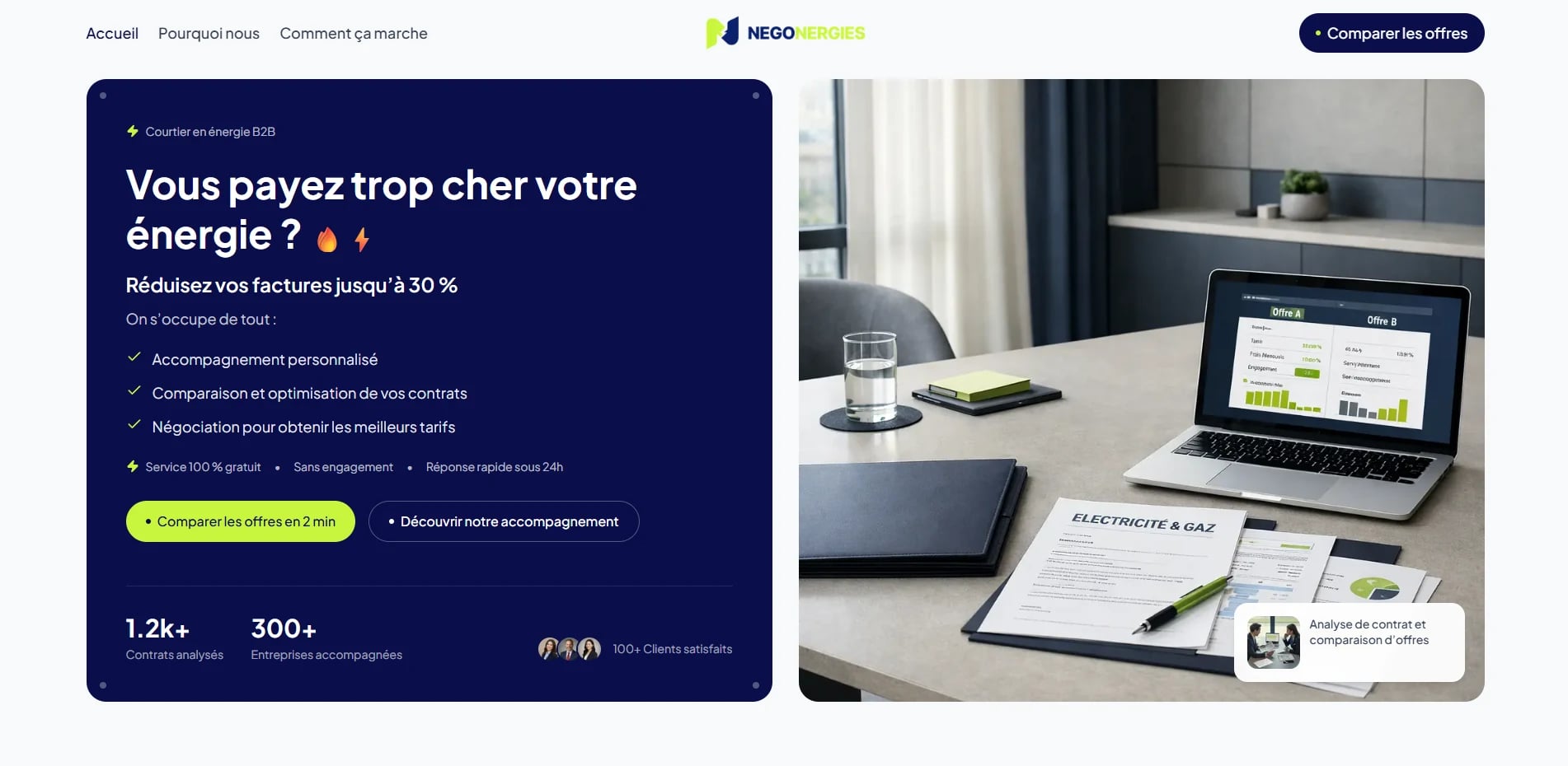
If you do not yet have permission to publish a client name, metric or image, leave it out. A smaller amount of honest proof is stronger than a polished claim you cannot support.
Give each page one obvious next step
A call to action should match the decision a visitor is ready to make.
Someone who already has a website may want a low-commitment second opinion. Someone planning a new tool needs room to explain the process. Those visitors should not be forced into the same form.
The label matters too. "Submit" describes what the interface does. "Get a Free Website Review" describes what the visitor receives. The second one reduces guesswork.
You do not need a button after every paragraph. Use one primary next step where it makes sense, then repeat it near the end for people who needed more context before acting.
Treat the form as the start of the service
The contact experience starts before you reply.
Ask only for information you can use. For an initial website review, the website address, contact details, main goal and a little context are usually enough. A long qualification form can make the visitor feel as though they must prepare a brief before they are allowed to ask a question.
The form should also explain what happens when delivery fails. It should validate fields on the server, handle personal information carefully, and avoid sending private values to analytics.
After submission, confirm that the request was received. Do not promise a response time unless you can consistently meet it.
Mobile clarity is business clarity
Mobile design is not a smaller desktop layout. A narrow screen changes what visitors see first, how quickly headings wrap, and whether the main action remains easy to reach.
Review the site at real narrow widths. Check whether:
- the opening message still makes sense before scrolling;
- navigation labels remain readable;
- buttons wrap cleanly and have comfortable touch targets;
- project images preserve the part that explains the work;
- forms do not create horizontal scrolling;
- focus states remain visible for keyboard users.
Performance belongs in the same review. An oversized hero image or a heavy animation can delay the information the visitor came to see. Optimizing that experience is more useful than chasing a perfect synthetic score at the expense of the design.
A quick website review checklist
Read the homepage as if you had never heard of the business.
- Can you explain the offer after the opening section?
- Is it clear who the service is for?
- Does the site show real work or another form of honest proof?
- Can you find the right next step without searching?
- Does the contact form ask only for useful information?
- Do mobile visitors receive the same clear message?
- Are claims specific, current and supported?
- Do page titles and descriptions explain the page to search users?
Do not fix everything at once. Start with the point that creates the most uncertainty. That is often the opening message, the service explanation, or the path to contact.
What to fix first
If visitors reach the site but rarely start a useful conversation, begin with the path from the homepage to the relevant service and then to the form. Read it in order. Every step should answer the next natural question.
Visual polish matters, especially when trust is part of the decision. But polish works best after the offer and next step are clear. A beautiful page with a vague message leaves the visitor with the same problem, only in a nicer typeface.
The goal is not to make every visitor click. It is to help the right visitor understand enough to make a confident choice.